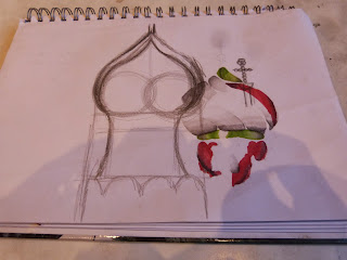
Monday 16 December 2013

limbo - /lɪmbəʊ/ noun

 Middle English: from the medieval Latin phrase in limbo, from limbus 'hem, border, limbo'.
Due to its location, the idustrial area of Ardwick is reminiscent of a place of limbo. Not quite in the city and not quite in the countryside, it is part of two places but not in either. With its twisted metal and huge machines it also portrays a hostile environment that is shown in so many religious paintings. I will try and use this in my images to get across the feeling a 'non place'.


Friday 6 December 2013

Stephen Shore


After I read Stephen Shore: Uncommon Places, it really made me realise the importance of lines in a photograph and how to manipulate them. I admire the way Shore does this with buildings, especially using corners and lamp posts. Another thing I like about his images is the emptiness,its peaceful and something about this makes it more honest in some way. Apart from the lack of life we can see, the simple, matching block colour schemes add to the minimalism and bareness.

Tuesday 3 December 2013

Andreas Gursky


Andreas Gursky photographs large scale landscapes in a deadpan style, voiding it of any opinion. What I like about his images is how there are small details which just become shades of interesting colours, this makes the viewer look harder at the image; which is what the aim of a photograph is. For instance his 'waste' image from first glance looks like some sort of sandy landscape. Once you look closer though you realise it is a huge expanse of rubbish.

Sunday 24 November 2013

Some images from the final shoot


These are some of the final images for this project. As I was using old expired film on some photos they didn't come out great so I will go back and re-shoot them. However I think it has been a success trying to recreate iconic tattoo images in a street/documentary style.

Wednesday 20 November 2013

Cezanne Landscapes


I love Cezanne's landscapes, specifically his method of painting. The daubs of paint which make up the image draw the viewer into the picture, trying to see clearly what it is and see all the details. Again one of the main aims of a photograph is to draw the viewer into it and make them look longer, I think the distinctive daubs make this happen.

Sunday 17 November 2013

Robert Voit - New Trees


Robert Voit's 'New Trees' is a perfect example of how I want to portray an industrialised area as a natural landscape. Here the trees are actually antennas and signal towers, disguised to look less invasive. In this way the images make something that is industrial look beautiful and more pleasing. I think one of the main strengths of this work is that its not obvious that the trees aren't real, you take it as just a picture of a tree and then the more you look into it you see they're not real, like two levels of seeing the picture. I want to have this effect with my images.

Friday 15 November 2013

The Bechers Industrial Photography


The Bechers photographed industrial sites and plants to document them as a list. In this way they can be seen out of their context and as interesting things, rather than just ugly machines. They are also photographed in a deadpan style to avoid pushing an opinion of the pros and cons of these sites.

Wednesday 13 November 2013

Ardwick Research

Ardwick began in the 19th century as a pleasant, wealthy suburb of Manchester, however it became heavily industrialised with the advent of the industrial revolution. Even worse when the factories and industries dwindled, Ardwick became one of Manchester's most deprived areas. Most notably Charles Dicken's sister leaved there and he would visit frequently, in fact Christmas Carol was inspired partly by the village, and Tiny Tim and Fan were based on his sister and frail nephew.  Today Ardwick is more stable but is still in need of development.

Tuesday 12 November 2013

Landscape Artist Statement

So after cycling and exploring round Manchester for a couple of days I have decided to base my project on square 102/103 of the 'A-Z Manchester' map. This is mainly in Ardwick along the Piccadilly train tracks that runs adjacent to the village. The area is heavley indutrialised with catacomb like structures surrounding and in the bridge of the railway.
I was first drawn to this place because it embodied the soul of Manchester; its history, its foundation and its strength. Its also a limbo-like location. This is where the city begins to change from a bustling, metropolitan full of people to the rolling hills and wilderness of the countryside. In the middle of these opposing environments is a sort of no-mans land; mostly places of work with spats of greenery in places which have been turned grey and unhealthy by industrialisation. Its an ugly place but we need it for the city to thrive, so is it a good thing?
Despite its looks, its an integral part of the city; because its an integral part of the city its ruined the land and looks ugly. I think this is a good question to keep in mind while progressing through the project. I will try and establish the need for this place and its limbo qualities by photographing it in a different light. Looking at photographers like The Bechers, Mark Power, Ed Ruscha and John Davies that photograph industrial sites in a beautiful way, I will try and make images that reflect classic landscapes from Ansel Adams and paintings. In this way I will portray the idea of limbo between these two states. I will also take inspiration from Alec Soth's 'Sleeping by the Missippi' project by following the train tracks and documenting alongside it.
Hopefully these aims combined I will be left with images that resemble classic landscape paintings but ones that show twisted metal, waste, factories and concrete. I don't want to pour an opinion on whether this is good or not, rather be neutral and force the viewer to ask it themselves. For this aim I will photograph in a deadpan style like that of Andreas Gursky.

Saturday 2 November 2013

First Photos

I started by taking pictures on the 'pharaohs horses' image. I asked 3 of my friends to stand in front of the mirror in the sort of position that the horses heads are in and start putting makeup on. I got this idea for recreating the image from going out one night; all the girls were clambering around a small mirror with their heads together getting ready and chatting. The image just reminded me of the horses heads so i asked them to recreate it. I tried using a DSLR for this as I want a modern digital image, desklamps and overhead lights to look like a serendipitous shot and ambient mood. I didn't pose them or have any special equipment because I wanted it to look like a documentary photograph and in the moment because I thought it would look less formal and more like the actual scene taking place. After looking at the images though they didnt look how I wanted them to. Because of the lack of light the image is hazy, theres too much going on in the room and objects around the girls create too much distraction for the viewer. Next shoot I will try in a more well lit place, maybe using daylight, with as little stuff in the room as possible. I also try shooting in the studio with a large or medium format camera for enhanced detail in the image. Also I don't think I want to have any reflections in the mirror, all the attention should be on the girls putting on makeup.


Monday 28 October 2013

Flash I will recreate

I have decided on the classic tattoo designs I will be recreating in photography. They are going to be in a modern manner drawing on influences from Jeff Wall and tableaux photography with a fashion/street photography view like Jeff Mermelstein, Martin Parr, Alec Soth and Stephen Shore. I will try and add a bit of humour into the photograph like Oscar Gustave Rejlander and make it so people of this generation will understand it and connect with the images. I have chosen these images because I think I will be able to create the best images for them, they are the most relevant to this day and age and they were also the most relevant to the past tattooists.


 End of the Trail, maybe something to do with coming home after a party or hard night out?

 Pharaohs horses, people pushing passed each other to get onto the bus or in a shop?
 Rock of Ages, child clinging onto mother?
 Sacred Heart, a rockstar or celebrity? homeless man or person selling newspapers?


And either an eagle or swallows, both have a long history in tattooing, whichever brings out the best image I will use. 

Saturday 26 October 2013

Drawings so far

So far I've been doing sketches and drawings to get a feel for the tattoo style and putting my own spin on them here are some pieces in progress -


Thursday 24 October 2013

Drawing my flash


This is my setup I've finalised on. I use Daler Rowney watercolour paper, Promarker pens with blender and Faber Castell indian ink pens. After trying watercolours like most tattooists I found I wasn't very confortable using them. I talked to a friend of mine in Churchyard Tattoo in Hitchin Hertfordshire and he suggested I try these pens, which work like a charm! I usually sketch out an idea roughly in my sketchbook, turn the page over and use my alptop as a lightbox to draw over it again with more detail. Then I'll use my 'lightbox' again to draw the design onto watercolour paper and go over it with pen. Finally I colour it all in! It made me realise how much work is put into just one drawing. I think though I might try different, darker colours next time though as these are a bit tooo 'cartooney'.

Tuesday 22 October 2013

Inspirational Table/Mantlepiece

So I like collecting random things and a lot of the time these can be inspiration for me in drawings and photographs. What I've done is put all my favourites on the mantlepiece and keep rearranging them hoping to 'see' a picture in them. for instance theres a lion statue next to a rabbit figure, from that I could draw a rabbit in a suit and crown like the lion. Plus it makes the room look cosier. After watching the tattoo age series I noticed all the artists use all their passions and mix them all together to create the art they do. One of mine is to collect weird stuff and I can already see that I feel more enthusiastic for drawing on all of my hobbies to create photographs and drawings.


Thom DeVita


Thom DeVita bridges the gap between fine art and tattoo art. His designs were based on classic designs and changed to his style. He also experiments massively with his work, drawing, painting, wax and chalk rubbings and different materials like cardboard, black paper, and wooden pallets. He started tattooing in New York City's Lower East Side in the mid 60s—when tattooing was illegal in the city—and quickly began to forge his own style. Thom drew from a wide variety of influences for his tattoos, everything from Pueblo Indian designs to Lord & Taylor shopping bags. He also formed relationships with other American tattooers who were revolutionizing tattooing by bringing in influences that went far beyond the usual array of images found in most American tattoo parlors at the time. This is my favourite episode of the tattoo age series as DeVita shows how important it is to keep pushing the boundaries and stay creative.

Tattoo Age, Vice

http://www.vice.com/en_uk/tattoo-age
Tattoo Age is a series on Vice.com showcasing the best modern tattoo artists. From all over America and the UK, big figures in tattoo are interviewed, filmed working and asked about the tattoo world at the moment. Its a great source of information to see how tattooists work nowadays and where they got their influences from. I found it interesting to see how artistic modern day tattooists actually are, many paint constantly and work in other mediums as well, its a good reminder that all though you have to throw yourself into a medium to be successful at it you also need outside influences to stay creative.

Sunday 20 October 2013

Tattoo Flash


Flash is what tattoo artists call their designs. They are usually on pieces of A3, drawn in pen and ink or watercolours, can be black and white or colour and any genre of tattoo. Flash is displayed on tattoo shop walls and used to be the sole tattoos available in shop, if it wasn't on the wall you couldn't get it. More recently, late 70's, Ed Hardy arguably brought in the concept of custom tattoos among other artists. Instead of being limited to designs on the wall, nowadays customers will usually always have a custom tattoo drawn up or designed already. Flash therefore is now more of a way of showcasing an artists talents, portfolios, or decoration.